Peter Payne, Pornographer

I’ve been censored again, ironically, by a pornographer. He has censored me before, so this time I saved my remarks, and I’ll post them here for your evaluation. But first let’s examine the censor.

Peter Payne first came to my attention in the early 1990s. Payne moved to Japan and started an online business exporting Japanese pornography. He sent pornographic spam hawking his wares to email addresses (such as mine) he harvested from Japanese-related Usenet newsgroups. I immediately complained to his ISP that I had no interest in receiving his pornographic spam. Payne responded by claiming I had signed up to receive the spam, when I would never do any such thing. But that was back in the days when spam was taken seriously by ISPs, so the spam stopped, despite Payne’s protestations of innocence. I would have been glad to never hear of him again.

But since his early days as a porn peddler, he branched out into selling anime and manga, becoming quite a self-declared authority on the subject. Payne now drones on about anime subjects on the Japundit blog. And here is where we tangled again.

Peter Payne wrote an absolutely absurd article about how Japanese people can’t deal with their memories from World War II except through the metaphor of anime and manga. When I paraphrase his argument this way, I convey it far more clearly and concisely than he did in the original article. Let me quote the paragraph that set me off:

If you asked Japanese who they considered the most respected “military heroes” of the country were, you might find some who would answer Amuro Rei or Bright Noah or Captain Okita/Captain Avatar, the legendary characters from these war-oriented anime series.

I responded:

When I ask my Japanese friends who are the greatest Japanese war heroes, they tell me stories of Oda Nobunaga, Toyoyomi Hideyoshi, Takeda Shingen etc. Not a single one of them has ever cited imaginary warriors from anime.


I suppose it depends on who you hang out with. I suppose it’s only natural that if you peddle porn and manga, you have lowbrow friends. But don’t let that warp your perceptions of Japanese society as a whole.

This is my problem with anime otaku. They spend so much time watching and discussing absolutely mind-rotting drivel, attempting to make it into something far beyond what it is: lowbrow entertainment. And then they make sweeping generalizations about Japanese society based on their “insight” into the culture, as they gleaned it from cartoons. I think this is terribly offensive, I argue that it is a thinly disguised form of racism. They are stereotyping a whole culture, based on ridiculous ideas they learned from comics or other comics fans.

So it is at times like this I enjoy pointing out that Peter Payne is a pornographer. A person who knows all the latest Japanese porn actresses but knows nothing about legendary samurai warriors (known by every Japanese schoolchild) could not help but form a warped opinion of Japanese culture. And of course he is particularly touchy about his profession, censoring any reference to it on the blog where he tries to “redeem” himself by pretending to be an astute cultural commentator.

Others agreed with my remarks, now the first comment in the censored thread starts, “I agree,” but she is agreeing with ME and not Peter Payne. This is not obvious since Payne deleted my remark. This is a devious way to manipulate your blog’s commenters, to make it look like they agree with the article, rather than agreeing with my dissent. This is shameful. But Peter Payne has no shame. That’s why he has a nickname: Peter Porn.

3 Point Writing

I’ve recently become acquainted with an extremely annoying style of writing. I’ve written about strange writing formats before, but this one drives me crazy. It’s the “3 point writing system.” I will give an extremely condensed example here:


I am going to explain that all brontosauruses are thin at one end, much thicker in the middle and then thin again at the far end.


All brontosauruses are thin at one end, much thicker in the middle and then thin again at the far end.


I have just explained that all brontosauruses are thin at one end, much thicker in the middle and then thin again at the far end.


There really isn’t much to it. The format works like this:

1. Say what you’re going to say.

2. Say it.

3. Say you said it.

It’s horrible. Please stop doing that.

Finnegans Autopsy

I was chatting with Matt over at the Japanese Literature blog “No-Sword,” he commented on a Japanese translation of James Joyce’s “Finnegans Wake.” And having had a tipple tonight (as Joyce was wont to do while writing) I was in a loquacious mood and was seized by the urge to write down my favorite Joyce anecdote. Hell, it’s my only Joyce anecdote. I may tell it badly, perhaps inaccurately, even drunkenly, but I guarantee it will be more coherent than “Finnegans Wake.” Well, it’s shorter, if nothing else.

Long ago, I read an article about a scholar at my school doing his PhD in English Literature. At that time, everyone had to write a new thesis on Joyce to be taken seriously in the English Lit field. But there were few remaining new angles on the topic. The scholar had access to the galley proofs of Finnegans Wake, he was analyzing Joyce’s revisions when he noticed something interesting. The proofs all had pinholes at the top, but not all the pages had the same number of pinholes, nor were they in the same spot. In a flash of insight, he realized what they were: the pinholes left by the typesetter when he tacked the stack of pages to his corkboard.

Joyce was notorious for incorporating typesetter’s errors into his text. Sometimes the typesetter made interesting errors while trying to transcribe the incomprehensible text into lead type. Joyce sometimes took the errors and rewrote them, coining new words out of the errors. Many scholars have argued over the etymology of these strange words, even using these same galley proofs as evidence. Multiple (and similar) copies of the same pages existed, but nobody could definitively determine which revisions came first.

But this scholar had a new approach. He measured the position of each pinhole, and determined the proofed pages were aligned in a stack and the pin driven through the stack into the corkboard. The aligned holes represent one state of the proof at one time. As the revisions were made, new pages would be inserted in the stack, and pinned again to the board. Those new pages would have one less pinhole. Through an incredibly complex procedure, he determined the order that new pages were added or removed from the stack. The scholar had finally determined the order in which revisions were made.

His thesis claimed that the final form of the book was the result of a lengthy collaboration between Joyce and the typesetter. Perhaps “collaboration” is too fine a word, “battle” might be more appropriate. Joyce would find an error, rewrite it, and then the typesetter would mangle it again. The galleys would go back and forth between the author and the typesetter, changing every time a new proof was generated. Eventually both Joyce and the typesetter thought no more revisions were necessary and the book was published.

Of course this discovery galvanized the Joyce scholars of the English Literature community. There was hardly anything new that could be said on the subject, whole libraries of books have been written on any subjective point of view propounded by every scholar with an opinion. But this discovery brought scientific rigor to the analysis of an incomprehensible work of literature. Even I was transfixed by this discovery, and I have no interest in Joyce whatsoever. But I learned one thing for sure: it is impossible to translate Joyce’s work into the English Language.

Palisades

My favorite landscape spot is a called “The Palisades,” I go there occasionally to take photographs, it’s especially beautiful in autumn, you can view the fall colors in the forests growing over stone cliffs next to the river. Here’s a fall photo of The Palisades in my special antique photochemistry printing method.


I use an antique photo printing method, it’s long been abandoned since it is very time-consuming, inaccurate and prone to failure. And this print was one of my failures. Each color of cyan, magenta, yellow, and black requires a layer of pigment emulsion, painted on the paper by hand. Each color is applied, printed, washed, and dried before the next color can be applied. Sometimes each color must be printed multiple times, I think this print has about 7 or 8 layers. This can take days.

And there’s the problem, one error in one layer can ruin days of work. Sometimes the error can’t be seen until all the layers are printed. This print had a problem with magenta, the magenta emulsion is the most difficult to get right, it’s almost always the problem. This print had a faint overall magenta stain that I couldn’t recover. It was quite a disappointment as I thought I got the color right except for that faint pinkish tint.

But today, I was going through my prints and it occurred to me, I should scan and color correct it in Photoshop and see how good the color was after removing the magenta. It won’t fix the original print, but I could see how it might have worked without that one error.

This color-corrected scan works pretty well, if I do say so myself. The printing method isn’t highly detailed, it has a scratchy, textured look that some people compare to an aquatint. Alas, most of that texture can’t be seen in this scan, only in the original print.

I like to leave the margins of these prints exposed, people always tell me how they like seeing the brushwork at the edges of the print, it shows that the work is clearly handmade. But I like seeing the registration marks, I’m proud of them. It isn’t easy to keep clear registration marks aligned through 7 or 8 layers.

Overall, the color worked well, except for the sky which was a little too pale. There’s a reddish patch in the middle which represents a patch of red shrubs, you can’t quite make out the shapes but that color is right. The green and yellow foliage in the trees have the right colors, and the grey stone wall is a proper neutral grey (it usually looks blue in the shadowed sunlight). I’m pleased with it, I didn’t pick this scene because it was such a great photo (it isn’t really) but because it would be a challenge to capture all these diverse color conditions in this inaccurate printing process. It was a good experiment, I was pleased with the results, even if it is far from perfect.

This sort of printing is known in the photo world as an “alternate process.” This process is extremely rare, very few artists still use it for color printing. I took one of my best color prints to a local gallery, prints of this type would generally sell for a minimum of $1000 to $1500, they offered to sell them for $250 with a 55% gallery commission. Sheesh!

Update: I decided I should put up a copy of the original uncorrected print, so you can see how bad the magenta stain was. Click the thumbnail below to see an enlargement.


R.I.P. Gelsy Verna

I was shocked and saddened to learn of the untimely death of Gelsy Verna. She was my favorite painting teacher, she taught me how to really paint. I was particularly shocked because I am working on some watercolors, I noticed how much they owed to what Gelsy taught me, I had a passing thought that I wanted to show them to her. Then the next day I heard she had passed away.

I still vividly remember when I first met Gelsy. I came back to art school to finish my long-abandoned BFA, and to my dismay, I found I had to take 4 semesters of oil painting, it would take 2 years. I’d already taken Painting 1, but that was the course that got me kicked out of art school 20 years earlier, so now I’m back with the freshmen starting from square one. I think this was Gelsy’s first teaching position, and her first semester at the U of Iowa.

Gelsy gave us our first assignment, she set up a crazy still life with strange lighting and told us to paint anything we’d like, but only using two colors, yellow and black. I thought this was an exceptionally strange assignment, but I had some top quality artist’s-grade oil pigments so I started mixing colors and painted away. But the oddest thing happened. All the other students were mixing yellow and black to get a range of greenish tones, but my pigments would not make a green. Gelsy was puzzled and tried to mix my paints to get the greens, but she couldn’t do it either. This was the whole point of the assignment, to learn how to produce the greenish blacks. We both concluded that the black+yellow=green trick only worked with cheaper student grade pigments. I still have that painting, I couldn’t bear to throw it out, no matter how bad it is.

Gelsy loved to give strange assignments that made us explore how painting worked. I remember once she had us do a small figure painting with special conditions: black and white pigments only, in a darkened studio with dim light on the model, to be painted in 5 minutes. Gelsy loved my painting, but I’m used to these quick assignments from drawing classes. This style of painting is just the opposite of what most painters do, traditionally you don’t use black oil paint at all, you mix a black from colors. But Gelsy really taught me about the use of black pigments, I used to joke with her that she got more range from black than I got out of the rest of the spectrum. So it was probably not surprising that I became more interested in black and white painting, in my final semester in painting class I completely eliminated color and just painted in black and white tempera paint.

Gelsy also ran the Senior Seminar every painting major had to complete in their last semester in school. I think junior professors were drafted into this teaching assignment, the newest professors brought fresh, outside influences to the school. The class helped students prepare for their BFA Clearance, where a committee of professors signed off on your degree. We spent our last semester critiquing each others work (always a dodgy proposition with a bunch of painters with senioritis) and preparing for our presentations. We also spent a lot of time arguing over theories and artists, I’ve previously written about our misadventures in that class.

I was nervous facing the BFA Committee, I’d worked hard but it was still possible to be rejected and not get your degree. The committee was stacked against me with my harshest critics. One of the professors was instrumental in me being kicked out of art school back in the 1970s, I always hoped he did not remember me from back then. Even if he didn’t remember me, he hated me anyway. Another professor was the painter I wanted to study with, but she didn’t like me or my painting. Gelsy was on the committee, I hoped she would be my advocate since she knew and understood my work. I displayed highlights of my work, was questioned about my methods and my results. Oddly enough, my photo printmaking seemed to win over the painters and put my work into context. I left the room, the committee deliberated for a few minutes while viewing my work, then delivered the signed statement approving my BFA. Congratulations, you are now an artist, now go away. No you can’t do your MFA here, we don’t take our own BFA graduates into our MFA program. You have to go somewhere else to get different influences.

Gelsy had an MFA from the Art Institute of Chicago, she always tried to introduce us to the Chicago scene. I encouraged her to stay and teach at Iowa, mostly for the selfish reason that I wanted to take more of her classes. She did stay here for quite a few years, and I always wondered whether or not I did her a favor by talking her into it. A couple of years after I graduated, I was in Chicago and saw her work in a gallery, I wondered what she was up to. I figured she’d moved on, so I asked the gallery if they had her contact information. The receptionist said she couldn’t give out that information but they could pass along a message, so I left my number. About 10 minutes later, my cell phone rang and there was Gelsy, asking me where I was. And I asked where she was, she said she was still in Iowa City, I could have looked her up in the local phone book. Oops, I should have kept in touch more.

I lost touch with Gelsy when she moved out of town, so it was a shock to hear the tragic news, the first I’d heard of her in a few years. The outpouring of grief from her students and friends, the people she affected, must be immense. Everyone loved Gelsy, she was a great teacher and painter, I was looking forward to seeing much more of her work over the years to come. But now she is gone, I feel a great loss, a great sadness. It is times like this when I wonder if there is a place for artists in this world. Gelsy tried to teach me how to find that place, but my mentor has left me alone and I despair that I will never find it.

Tech Support

I do a lot of tech support for my friends, I’ve worked in tech support for years. I have noticed there tend to be two types of tech support calls. There are calls about serious problems that need tech intervention. But more often, the calls are from someone who hasn’t done a single thing to research their problem. These calls can be frustrating, my friend calls and says “I’m in Photoshop and I can’t get the thingummy in the whatchamajigger” (that’s a direct quote) and it takes me an inordinate amount of time to figure out he’s trying to find a path command in the layer palette. Sometimes I just look in the program’s help file, once I figure out what the question is, the solution is easy if you just look in the help files. I don’t mind so much that the solution is trivial, I just mind that it takes so long to figure out the question.

I’ve recently been thinking of my first tech management job, I was Service Manager at ComputerLand of Glendale back around 1981. I told the boss I didn’t feel qualified, he said, “don’t worry kid, after 3 months you’ll have seen it all and know it all.” And he was right, the daily grind of repairs and tech support seemed like old hat after a few months. But there were ongoing tech problems, I remember one problem that seemed to take way too much tech effort, or at least, way too much of my effort. When the first memory cards for the IBM PC came out, the technicians could not figure out how to set the DIP switches. All day long, the techs would interrupt me with questions about setting the switches, when they could easily have figured it out for themselves. It was easy, you just set the switches to the binary address of where you wanted the memory to start. But none of the techs knew binary math, so they were always baffled.

I decided to close the shop one morning for a class to teach the techs how memory addresses worked and how to do the binary math. We went through all the fundamentals and they seemed to get it. We went through the manuals and worked out how the cards functioned. I demonstrated the formula to calculate the addresses. I described as many ways to solve the problem as I could figure out, and gave them all the tech support phone numbers I called when I couldn’t figure it out. Then I gave them a written exam. The exam was just one question, I didn’t even want the solution, I just wanted them to describe at least 4 places to look for the answer, “How do I configure Memory XYZ at location ABCD?” My point was to teach them how to find their own resources to solve problems, before asking me. But I was astonished when the techs handed in their tests. Every single one of their lists started the same way:


1. Ask Charles.

Planetary Aspects of the Cards, by Arne Lein

I stumbled across some discussions on the internet and discovered I may be the only one who knows certain facts about a mystery. A little web searching indicates this message will be the only published facts about the mystery. So I suppose it is my duty to post the information. Don’t ask me how I know this (ha).

Arne Lein was a famous cartomancer, his book “What’s Your Card” is the definitive documentation of the Card System of Olney Richmond and the Order of the Magi. But since Arne’s death in the 1980s, his book has gone out of print, used copies go for astonishing prices on the used book market. There seems to be a question about the rights to Arne’s books since his death. I wasn’t able to find out what happened, but it appears Arne’s heirs don’t want the book reprinted. Go figure.

The bigger mystery remains, Arne had a second book that was never published, “Planetary Aspects of the Cards.” This was to be the ultimate detailed guide to the Card System for advanced students. Arne showed me the book and complained that his computer, an old TRS-80, was dying and he couldn’t get the text moved to a new computer. I said I’d gladly help him convert it to a new computer, just to help it get published. But nothing ever came of my offer. I saw Arne a short time before his death, I asked about his book, he said he still had it sitting on the old disks.

I suspect that Arne went to his death with a couple of 8 inch floppy disks sitting on his shelf, his magnum opus unpublished. If the family or heirs of Arne Lein possess these disks, they should know that a lot of people would like to publish them.

New Ringtone

I changed the ringtone on my iPhone, it was driving me crazy. I used the “Old Phone” ringtone, it is the loudest sound that comes with the iPhone. But it is muffled sometimes when I keep the phone in my pocket, it sounds distant, I can’t quite tell where the sound is coming from.

But what really drove me crazy is that the Old Phone sound is the exact sound effect used in TV and movies. What drove me over the edge was when I watched an episode of Law and Order, they used the sound repeatedly, with several phones ringing at once. So I searched around and the loudest ringtone I found was CTU-ringtone (download is in iPhone format and ready to install).

Apparently this is the phone sound from the TV show “24,” I don’t watch it so I wouldn’t know. It reminds me of the sound of the old AT&T Merlin phones, we had a fancy Merlin rig at an office where I worked.

Fortunately, the new IPhone 1.1.3 upgrade makes custom ringtones easy. I tried importing sounds into GarageBand but it crashed every time I tried to export to the phone. And this is supposed to be the new feature that made it easy.

I discovered I could just import a sound file into iTunes, then re-encode it to AAC. Once the file is encoded, you can change the extension from .m4a to .m4r. New in the 1.1.3 software, you can manually manage files on your iPhone, enable that feature on your iPhone settings. Then dock your iPhone and in iTunes drag your .m4r file to the iPhone’s Ringtones directory. Your ringtone is installed and ready to use.

Once I changed to a new ringtone that did not sound like Old Phone, I felt much better, I wasn’t listening for that ringtone anymore, the new tone is different enough that it grabs my attention. But I still keep imagining I hear the Old Phone. Some people call this the “Edison Effect.” Thomas Edison thought he heard voices in the static of Marconi’s newfangled Radio. But it is an illusion, the brain always tries to impose some sort of order on randomness. For example, many people have thought they heard the phone ring when in the shower, the brain tries to pick out sounds from the random white noise of splashing water droplets.

And now I’ve got a similar phenomenon. My furnace is really loud when it’s running, sometimes it makes a faint ringing sound when it runs, just enough to make me wonder if I’m hearing Old Phone.

A Leopard Trick

One of my favorite obscure MacOS X 10.5 “Leopard” features is the customizable Finder bar. I took a screen cap of the folder with the graphics from my last blog entry.


Look closely under the word “Sony.” There’s a little round icon, it’s not part of the MacOS X icon set. Look over on the left, it’s the same little icon as my Downloads G5 folder. If you drag a folder to the Finder bar, it will stick; option-drag it away, it will disappear with a “poof.” Click on the icon and you’re instantly transported to the folder. I understand you can put other things on the Finder Bar, like apps or Applescripts, but I don’t like too much clutter. It is incredibly convenient to put shortcuts there, it’s much quicker than searching through the sidebar.

One of the reasons this looks so good is because of the beautiful icon. Its gray tone matches the Finder well, it isn’t too intrusive, you’d hardly know it’s there. I found it on a Japanese icon designer’s website, I’d give him credit if I could remember his name. He made beautiful, subtle icons, which were all totally useless to me except this one.


Sony Style 1996

I bought some Sony gear in 1996 when I was in Tokyo. In some ways, this gear represents Sony at its peak, these designs have never been surpassed. And in other ways, it is all totally obsolete. But it continues to serve me well, so I thought it deserved a little homage.


I was shopping in the consumer electronics stalls in Akihabara when this Sony SRS-T10 portable speaker caught my eye. The design was so compelling, it was a little round oval like a clam shell. It’s a limited edition that was never sold outside Japan.


I asked if I could see it, the speaker opened up like a flower, I said it was beautiful. But the vendor said, “You don’t want to buy this, it sounds like crap!” I figured it was about as low-fidelity as I could tolerate, but at least as good as the speakers in a laptop. He insisted I hear it before he would sell it to me. The vendor loaded it with batteries and plugged it into a little CD player, I thought it sounded fine, considering how cheap it was, under $20. So I bought one, much to the exasperation of the vendor, he thought I was crazy to like such a piece of crap.


I asked the vendor if he had anything that sounded better. He showed me a slightly bigger model, the SRS-T50. This model had more batteries and can pump out a lot more volume. It uses the same basic design with little wings that fold out to reflect the stereo sound. But the vendor objected again, he said this speaker sounds like crap too. So once again, I had to hear it before I could buy it. I thought this model sounded pretty darn good, so I said I would take two of them, and again, the vendor growled with exasperation, I had to laugh. I gave one of these speakers as a gift to my brother, he said everyone asks where he got it, and comments on how good it sounds.


It’s a shame Sony never sold this particular unit in the US, they sold the same speaker in a garish yellow and grey “Sports” design that was a huge flop, I think it would have done better in the stylish Tokyo black and grey. My only problem with the design of the SRS-T50 is the placement of the power switch on the top. I throw this speaker in a bag or suitcase, the switch gets bumped and it powers on, wasting the batteries. So I usually just put a piece of tape over the switch before I carry it.

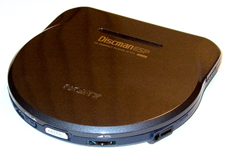
That’s my pet peeve, I used to carry my CD player in my briefcase, the switches would activate, and by the time I discovered it, the batteries were exhausted. I looked around a long time for a CD player with no protruding switches, I was determined to find the ultimate design, it took a few weeks of research, but I finally found the Sony DiscMan ESP D-777.


This was really what I’d gone into this store to buy, this premium CD player was hard to find and I’d spent weeks hunting for it. Now the vendor was quite pleased, he said, “oh yes, this really is excellent equipment, Sony’s best. But it’s quite expensive.” And indeed it was, for it had Sony’s latest design. This was the thinnest CD player ever made, the smallest, most minimal mechanism that could play a CD, thanks to the new NI-MH battery design. Previously the thinnest CD player had to be thicker than its AA batteries. Now it only had to be thick enough for the rechargeable NI-MH flat packs, about 2/3 less space.


What really sold me was the remote. All the new music devices in Japan used little remote controller badges, you’d clip it on your lapel and plug your headphones into it. Then you could remotely control your CD player, skip tracks, adjust the volume, etc. without ever having to touch the player. You can see my remote buttons are worn down from constant use, but the player is in pristine condition. I used to keep the player in its case in my jacket pocket, with the badge clipped to my lapel. Everyone in the US asked what it was, there were no remotes like that available in the US yet.


I remember paying about $200 for the D-777, which was a lot of money even back then, most portable CD players were between $50 and $100. About 9 months later, I saw the newly imported D-777 for sale in Best Buy for $395. What a deal. But there still hasn’t been a CD player made that’s better than this unit.

And that’s the problem with the D-777, it was a huge design accomplishment, Sony still lists it on their history website as one of their greatest products ever. But today you can get a better music experience in an iPod Shuffle that’s smaller than the Sony remote controller. The D-777 was the last, best CD player ever, I used to mix and burn my own CDs and I carried it constantly, it was so light and easy to carry. But mp3 players made it totally obsolete. Still, Sony’s design innovations like the remote controller were very influential in the design of the next generation of mp3 players.

I haven’t used my CD player in years, not since I bought my first iPod. But the speakers still work great, and I plug them into my iPod and iPhone all the time. The speaker technology is outdated, but I’ll keep using them until I find something that sounds better, and looks better.

© Copyright 2016 Charles Eicher