Category: Art
iPhone 6s Shoots Beautiful Panoramas
The iPhone 6s takes wonderful panoramic photographs even under challenging light conditions. The files are huge, suitable for high res inkjet printing at very large sizes. The bottom panorama could be printed 45×12 inches at maximum quality and would probably look pretty good at double that size. It has good dynamic range, even shooting into the sun at sunset. I particularly like the camera’s sensitivity to subtle gradients, like the murky, translucent water giving way to reflections of the sky. These photos are completely unretouched other than cropping. I tried hard to improve the brightness of these scenes and I decided the original images could not be improved.
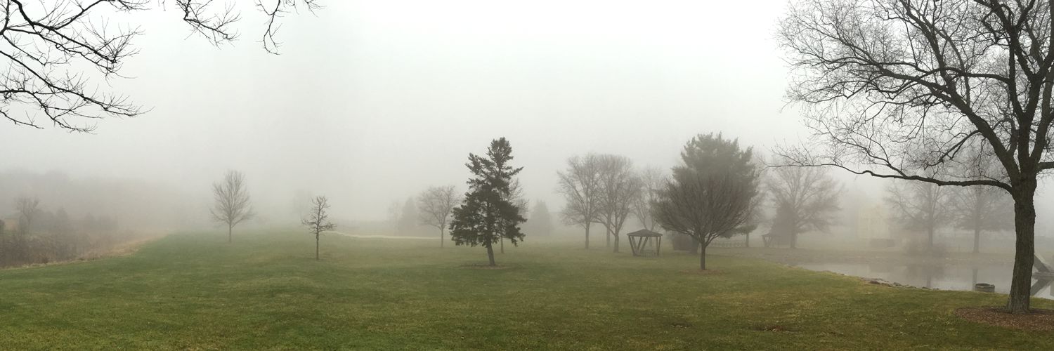
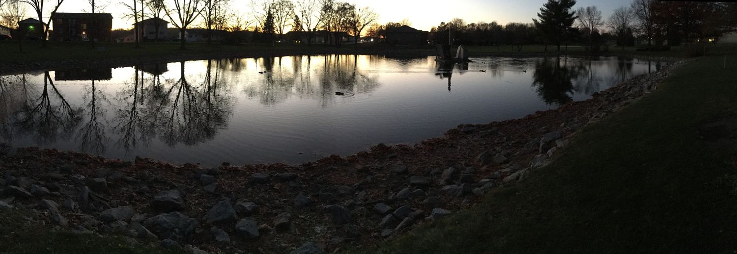
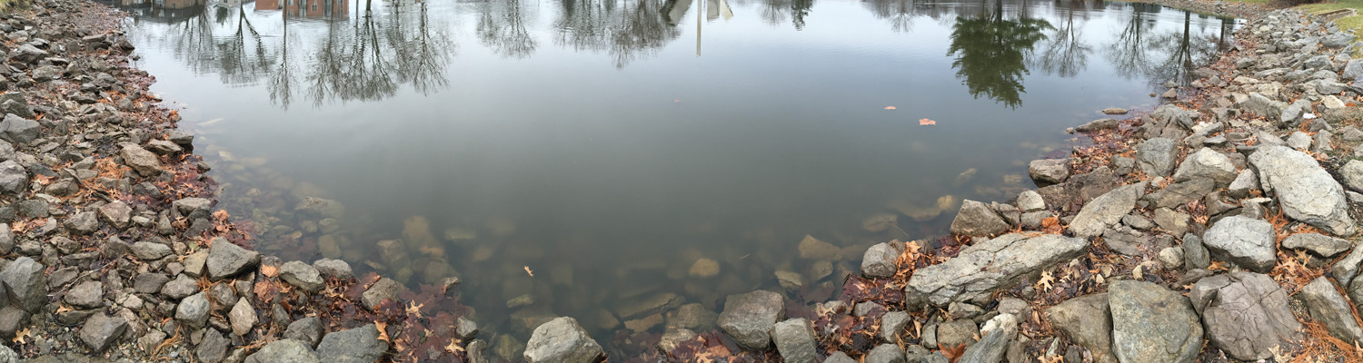
Click an image to see a higher resolution. Original photos and content © 2015 Charles Eicher
iPhone 6s Shoots Beautiful Slow Motion Video
Open full screen to see HD 720p 240fps video.
I Want To Be An Anglepoise Lamp
The Soft Boys – (I Want To Be An) Anglepoise Lamp – 1978
When I first entered Art School, one of my first purchases was a Luxo Lamp. It’s a classic design that has endured the test of time. It was cheap, I think I only paid about $20. I clamped it to the edge of my drafting table, and I kept it attached to my various desks over the next thirty years. A few years ago, it fell apart and I threw it out.

Recently I decided to buy a new Luxo Lamp. I thought it would be cheap, I looked online and now they’re over $165! My local art supplies store has a generic model listed online for about $18. What a deal. I went to the store, cash in hand, but they were sold out. I could order it online, but I hate to buy a cheap knock-off without seeing it first. It might be too cheap.
I checked at various outlets around town, I thought it would be easy to find a cheap swing arm lamp. But no. The best I could find was a cheap knock-off of the Luxo Jr. at Target, for about $40. It was only about 18 inches tall, that defeats the whole purpose of the Luxo. The classic Luxo LS-1 has a 45 inch reach, you can put it up high and illuminate your whole desk, or pull it down close for more brightness. I used a 100w full-spectrum incandescent bulb which has a good color balance, so I could work at night and still be able to judge colors accurately.
Unfortunately, this is probably the worst time in recent history to buy a desk lamp. New Federal energy standards were imposed on incandescent bulbs to make them more efficient. Of course some people think it’s a conspiracy and are even hoarding light bulbs. That’s ridiculous, new energy-efficient incandescent bulbs are already on the market, they are better than ever. There are plenty of alternative bulbs that are even more efficient, CFL bulbs have been around for a while, but people don’t like them because they have a colder light. I don’t like them because they have Mercury in them and you have to recycle them. Stores that sell CFLs are required to take them back and recycle them, but I’m sure they just throw them in the trash. Now LED lighting is getting cheaper, but it’s still really expensive.
So I thought maybe instead of the lamp, I’d try to get brighter bulbs for my wall-mounted lamps. They have tiny Type B sockets so the biggest bulb I can use is 60w. I have been looking everywhere for some simple 60w-equivalent LED bulbs that would fit. The standard bulbs put out 650 lumens, but I can’t find any LED bulbs that would output anything close to that. My office is already too dim, I want more light, efficiency be damned. It might be better to replace the whole wall fixture to use the regular Type A bulbs.
Now I am back where I started, no new lamp, and a dimly lit office. I suppose I will have to do some serious research and buy a proper LED desk lamp. That’s going to be expensive, I haven’t seen a decent model for under $100. The only thing that bothers me about LED lamps is that they don’t burn out, they just get dimmer. It will take a long time, maybe 10 years before they become noticeably dimmer. It will happen so gradually, nobody will notice. The manufacturers don’t know exactly how dim they will get. I kept my old Luxo for thirty years. I could keep a new LED lamp for another thirty, and eventually I will be back where I started, in a dimly lit office.
My Art
People always ask to see my artworks on the web. I always tell them I can’t put them on the web, or anywhere else. You have to see them firsthand. I use an antiquated alternate photo process, Gum Bichromate. I can make photographic prints with any watercolor pigment, I use metallic pigments that change appearance depending on the lighting and the angle you view them. Taking a photo of the artwork would be like trying to take a photo of a mirror.
But I can show the prints on video, so I can view it from multiple angles, and demonstrate how the prints change as I move. The iPhone takes decent high rez videos, so I made a couple of videos to demonstrate the effect. I figure this gives you about 5% of the experience of viewing the print with your own eyes.
This 8×10″ print uses copper, silver, and gold pigment. The gold lines are nearly transparent if you look straight at the print, but at an angle, they shine brightly, showing a birefringent effect. The different pigments reflect at slightly different angles, the silver is nearly invisible when the gold is bright.
Here is a larger 11×17″ print, it’s one layer of solid gold and very reflective, not translucent like the previous print. I intended to print on top of this gold layer, but I found a blurry spot I didn’t like so I rejected it. Printmakers would call this a “state proof,” it’s a proof print of one layer I applied to a different print. But it’s pretty interesting by itself.
This type of fine art photographic printing as an artform is becoming commercially unviable. It can’t compete with the low cost of modern inkjet printing, which dominates the photo print market. Gum prints are extremely labor intensive, every print is custom made and unique. The process is very unstable and difficult to use, many prints fail, ruining hours of work. The larger the print, the more difficult and more expensive it is to produce. That’s why the Gum Bichromate process was abandoned and became a lost art.
But the Gum Bichromate process can do things that no other process can achieve. I have spent decades refining the process, finding ways to reduce the cost of producing the negatives. Recently I made some technical breakthroughs and found a way to reduce the cost of the most expensive materials: the negative. It’s a contact printing process, so if you want an 11×17 print, you need 11×17 negatives, usually several of them. I used to pay $35 for those negatives, now I think I can make them for about $2.
So now I’m about to do another edition of prints. Perhaps these will be inexpensive enough to be affordable, so I can put them in an art gallery where people can actually see them firsthand.
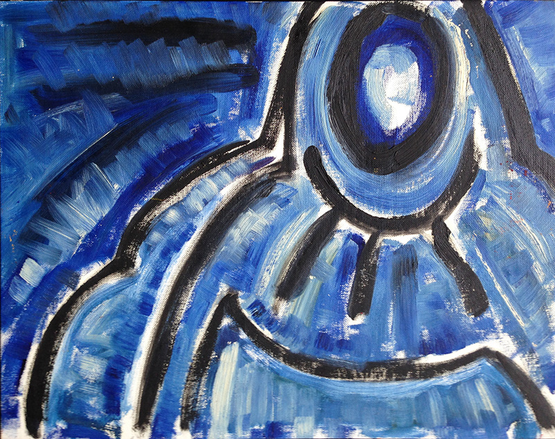
1994: Oil Studies
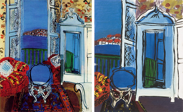
I recently wrote an essay The Copyist about a project I did way back in art school around 1994, when I made studies from an oil painting by Raoul Dufy, I’ll show the Dufy original on the left and my final study on the right.
Today I found three oil studies on 14×18″ panels from that same project. I completely forgot these studies existed, I haven’t seen them for years. The studies are sloppy and unfinished, mostly they are experiments in composition, color schemes, and most particularly, how Dufy made those fluid black lines.
I think I picked Dufy to study because that is exactly not how I paint. I was taught that you never laid down big black lines, that’s drawing with paint, it’s not really painting. Oils can lay down smooth gradation of colors, but Dufy used bold black lines and flat colors, it’s like a coloring book with black lines and only a few bright colors of crayons. That is not how you’re supposed to paint. And yet he does it so well. I always like trying something different, so I started by playing around with his forms. Here’s the first study. I am obviously making no real attempt to make this painting look like the original, I’m just trying to paint like Dufy.
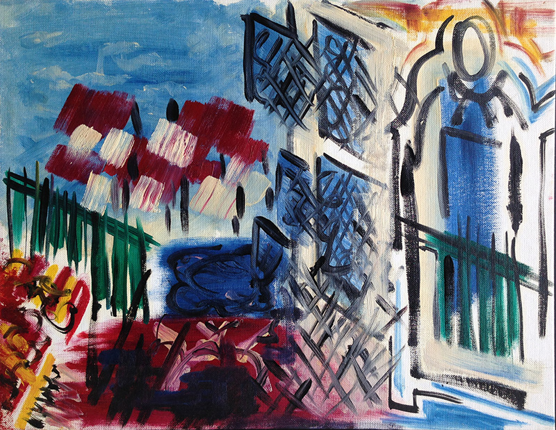
You can see I’m trying to copy Dufy’s black lines, painted wet over wet. That technique is called Alla Prima and it the way Dufy does it is terribly difficult. To make the black lines, I bought a pinstriping brush with hairs about 3 inches long, it can load a lot of pigment and flow it out in long lines. It didn’t work so well on a wet canvas but it was the best I could do. I figured Dufy used a similar brush, he just used it constantly as one of his primary tools so he was expert with it. And you can tell I’m no expert, like for example in the lower left middle it kind of got away from me and ended up a big black smear. Oops.
The painting turned out weirdly cubist, since I made several attempts at the black lines. I’ll show you a closeup.
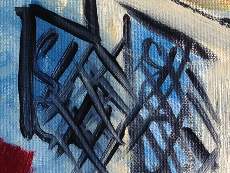
When you paint alla prima, the brush tends to drag up the wet paint and this is a perfect example. On the left, the strokes mostly had dark edges with a blue center. On the right side, the strokes are blacker because the paint underneath was already dry. Some colors like Cadmium Red and Yellow are notorious for slow drying and almost impossible to paint wet over wet. But Dufy did it, so I had to figure out how. Here’s another closeup.
That’s extremely close up. You can see I’m trying to lay down black lines over the red and yellow stripes, but I’m still dragging up paint. But still it’s a pleasing effect if you can control it.
The study also experiments with Dufy’s flat imagery like the cabinet with a mirror that reflects the outdoor scene, but the perspective is deliberately odd. And he also made some strange color choices, like pale orange-browns that I had a hard time duplicating. Oh well, let’s move on to the next study.
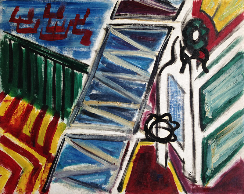
Yeah, I was getting bored with this subject. The cabinet is mutating and the composition is all askew. I’m still experimenting with those black lines, they’re getting better. I don’t know where that zig zag down the middle came from, or those off-white tones. It’s time to move on and do something else.
I produced one more oil study in this series, but it only barely referred to the original Dufy work. I focused on the oval shape at the top of the cabinet and enlarged it greatly. Here I can experiment more directly with Dufy’s method of painting black lines and laying flat colors around them. This is probably the only oil sketch here that can stand on its own as a painting.
Here I am deliberately messing around with wet over wet, except I’m deliberately pushing blue into the black, or white into the blue. It’s easier to test the technique when you’re working with only one color, it doesn’t change the hue, only the value changes when you add black or white. The upper left side was particularly good, here’s a closeup.
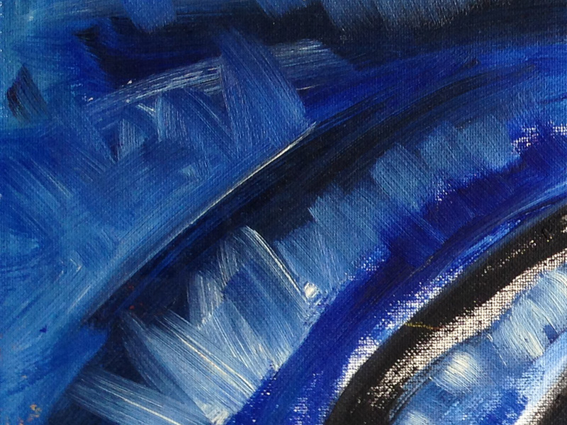
This was the point where I finally started to figure out how to paint. Notice the white brushstrokes that pushed into the blue paint underneath. The blue paint was dragged up without mixing into a completely flat, mushy color. The brushes pushed pure white at some parts of the stroke, mixed blue in others, and left the blue mostly untouched at other parts. Above that is a section where I dragged some black into the blue areas. Now that’s alla prima.
Since these are my early student works, I really didn’t quite know what I was doing. But it’s sometimes interesting to look back and see where I started to work it out.
1990: My First Photoshop
I was rummaging through my archives and found my first serious work with Photoshop version 1.0.
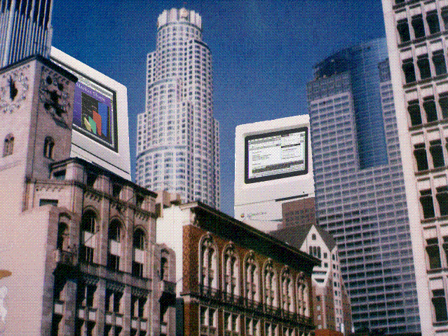
This is a little time capsule of obsolete technology. I took the photo of the Los Angeles skyline with a Polaroid SX-70 camera. The image itself is 8-bit dithered, I don’t think Photoshop did 24 bit color yet.
1994: The Copyist
Twenty years ago, I produced a painting study for my class with Gelsey Verna. She gave an assignment to copy from a painting. I decided to work from a Raoul Dufy painting I saw at the Art Institute of Chicago. Here is the original on the left, with my study to the right.
I wasn’t really interested in using his distinctive style of flat colors with black lines over it. I was interested in how he actually painted it. How did he get such strong black lines over wet paint? That’s called “painting wet on wet,” it’s tricky.
I had a very difficult time replicating his technique. I finally used a pinstriping brush normally used in sign painting. I could load the brush with a lot of paint and lay down flowing black lines. But it is long and floppy, so I could not get the fast, consistent strokes that Dufy used. Oh well, that is his primary style, he is well practiced and I am just a painting student, trying to reverse engineer it. I am sure he used a different brush technique than I did.
While making this study, I did learn a lot about wet over wet painting. I thought I did a few spots well, like the red couch on the left. It took the yellow and black overpainting just like the original. And a lot of my black crosshatching in the center seemed fast and rhythmic like the original. But some of Dufy’s color choices are rather strange. I just could not match that pale gold in the upper right or the purple on the lower right.
I only copied parts of the painting I wanted to analyze, simplifying the overall composition. You can’t make an exact copy anyway. What if it turned out brilliant, and someday someone thinks they found a long lost Dufy work?
Art students have a long history of copying paintings, and many museums have a long traditions of allowing Copyists to come into the gallery with their easel and oil paints and work right in front of the real painting. I always wanted to go to the Art Institute and copy directly from the original Dufy. But after I completed this study, on my next visit to the museum, the painting was not on display. Even today it is still not back on display.
1974: Broken Glass
Polaroid SX-70 print, circa 1974.
Assorted Scissors
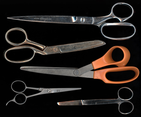
I have a lot of scissors. I put a few of them on my scanner, here they are from top to bottom.
Long scissors. Just over 9 inches long, with a 5.5 inch cutting blade. This scissors is very hard to use.
Heavy scissors. This scissors had a hard working life. It is rusty and corroded, and is too beat up to use. The side is stamped “Richards of Sheffield.”
Fiskars. Good general purpose scissors. Easy to use, I use it a lot.
Hair scissors. I don’t know why I have this, I wouldn’t trim my own hair.
Surgical Scissors. Very sharp and good for small, accurate cutting. I use this scissors the most.