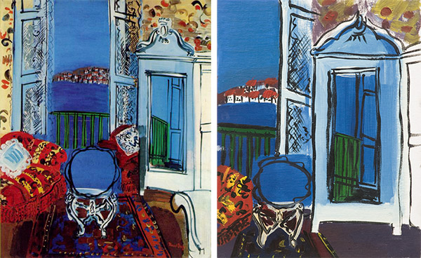
I recently wrote an essay The Copyist about a project I did way back in art school around 1994, when I made studies from an oil painting by Raoul Dufy, I’ll show the Dufy original on the left and my final study on the right.
Today I found three oil studies on 14×18″ panels from that same project. I completely forgot these studies existed, I haven’t seen them for years. The studies are sloppy and unfinished, mostly they are experiments in composition, color schemes, and most particularly, how Dufy made those fluid black lines.
I think I picked Dufy to study because that is exactly not how I paint. I was taught that you never laid down big black lines, that’s drawing with paint, it’s not really painting. Oils can lay down smooth gradation of colors, but Dufy used bold black lines and flat colors, it’s like a coloring book with black lines and only a few bright colors of crayons. That is not how you’re supposed to paint. And yet he does it so well. I always like trying something different, so I started by playing around with his forms. Here’s the first study. I am obviously making no real attempt to make this painting look like the original, I’m just trying to paint like Dufy.
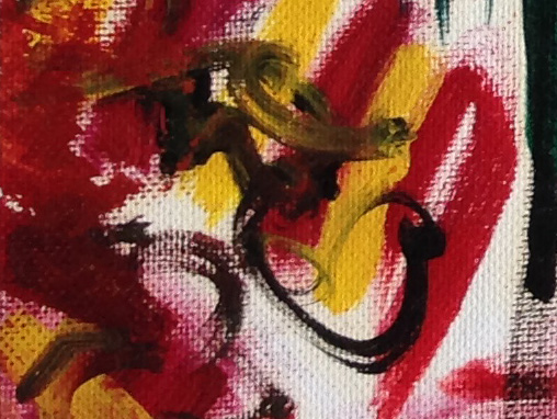
You can see I’m trying to copy Dufy’s black lines, painted wet over wet. That technique is called Alla Prima and it the way Dufy does it is terribly difficult. To make the black lines, I bought a pinstriping brush with hairs about 3 inches long, it can load a lot of pigment and flow it out in long lines. It didn’t work so well on a wet canvas but it was the best I could do. I figured Dufy used a similar brush, he just used it constantly as one of his primary tools so he was expert with it. And you can tell I’m no expert, like for example in the lower left middle it kind of got away from me and ended up a big black smear. Oops.
The painting turned out weirdly cubist, since I made several attempts at the black lines. I’ll show you a closeup.
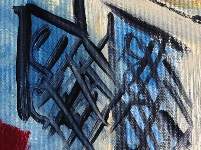
When you paint alla prima, the brush tends to drag up the wet paint and this is a perfect example. On the left, the strokes mostly had dark edges with a blue center. On the right side, the strokes are blacker because the paint underneath was already dry. Some colors like Cadmium Red and Yellow are notorious for slow drying and almost impossible to paint wet over wet. But Dufy did it, so I had to figure out how. Here’s another closeup.
That’s extremely close up. You can see I’m trying to lay down black lines over the red and yellow stripes, but I’m still dragging up paint. But still it’s a pleasing effect if you can control it.
The study also experiments with Dufy’s flat imagery like the cabinet with a mirror that reflects the outdoor scene, but the perspective is deliberately odd. And he also made some strange color choices, like pale orange-browns that I had a hard time duplicating. Oh well, let’s move on to the next study.
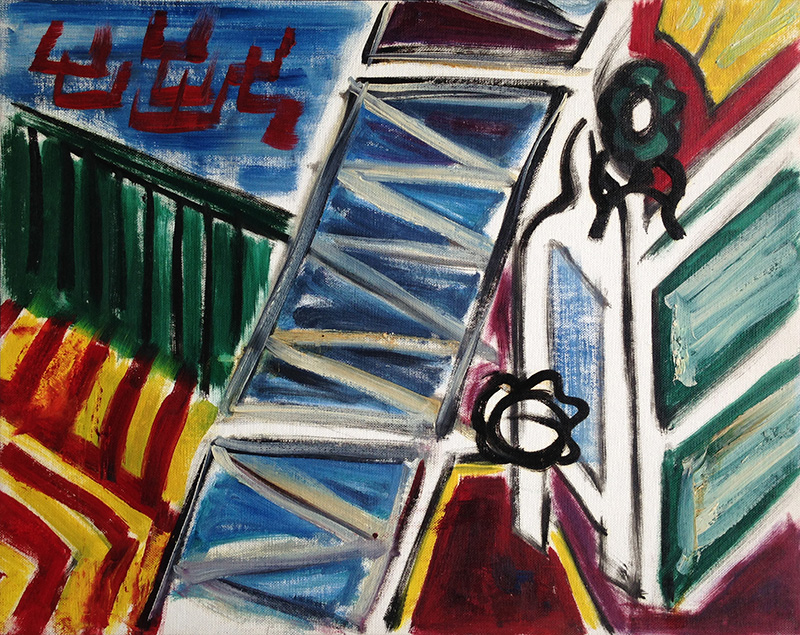
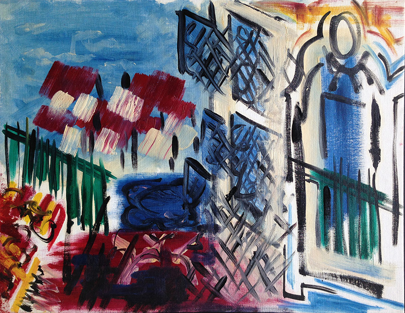
Yeah, I was getting bored with this subject. The cabinet is mutating and the composition is all askew. I’m still experimenting with those black lines, they’re getting better. I don’t know where that zig zag down the middle came from, or those off-white tones. It’s time to move on and do something else.
I produced one more oil study in this series, but it only barely referred to the original Dufy work. I focused on the oval shape at the top of the cabinet and enlarged it greatly. Here I can experiment more directly with Dufy’s method of painting black lines and laying flat colors around them. This is probably the only oil sketch here that can stand on its own as a painting.
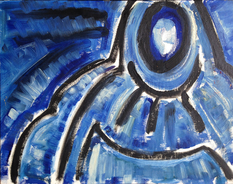
Here I am deliberately messing around with wet over wet, except I’m deliberately pushing blue into the black, or white into the blue. It’s easier to test the technique when you’re working with only one color, it doesn’t change the hue, only the value changes when you add black or white. The upper left side was particularly good, here’s a closeup.
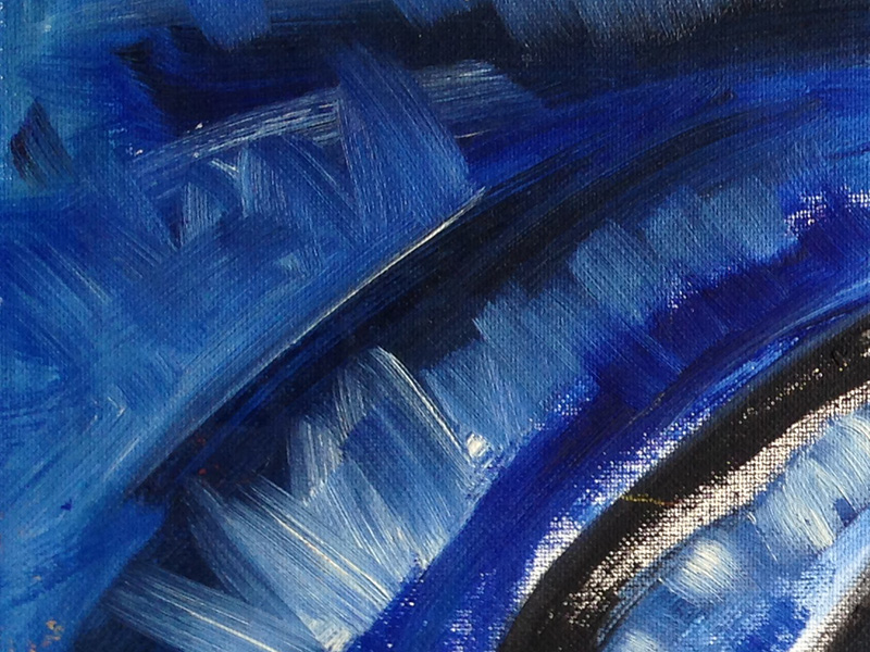
This was the point where I finally started to figure out how to paint. Notice the white brushstrokes that pushed into the blue paint underneath. The blue paint was dragged up without mixing into a completely flat, mushy color. The brushes pushed pure white at some parts of the stroke, mixed blue in others, and left the blue mostly untouched at other parts. Above that is a section where I dragged some black into the blue areas. Now that’s alla prima.
Since these are my early student works, I really didn’t quite know what I was doing. But it’s sometimes interesting to look back and see where I started to work it out.