Apparently I missed the latest coffee trend, “pour over” brewing. Apparently I missed this because I have done this before, I thought it was just the proper way to drip brew coffee.
Author: Charles
1993: Sphere Study

Rounding Error

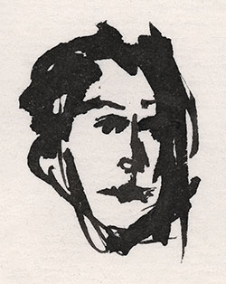
1995: Tiny Portrait
2004: Koi
Here is another experimental print in my antique photochemistry process, I think I made it around 2004. Like a lot of prints I make, I thought this one was a failure. It certainly didn’t turn out the way I intended. But I decided it was not such a failure after all. This is a very large print, 11×16 inches, the largest print I ever attempted in this media.
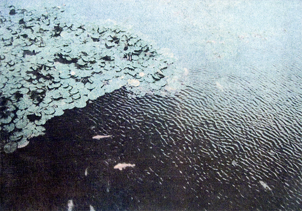
I took this photo with a cheap Fuji disposable 35mm camera, this is the moat at Goryoukaku Fortress in Hakodate, Japan. I scanned the little 5×7 inch print and made digital color separations, that’s where I made the error. I was experimenting with CMYK “undercolor removal” for this color separation. When you have a dark, neutral color, it usually has a large amount of cyan, magenta, and yellow in it, in addition to black. UCR removes those “undercolors” and replaces them with black. But it was a failed experiment, the colors all went too much towards black, which covered up a lot of the brighter colors. This process is fairly high contrast, it has trouble conveying subtle colors. But I did manage to capture some nice, smooth tonal changes that are normally beyond the range of this process. There is a subtle change of light color across the top, as the green lotus pads float in in the blue water. But the darker tones in the left corner went to almost totally black, they were actually dark blue. I think this UCR method is not the way to go for this process, most people only print CMY and don’t print the black at all. This print might have done better with a lighter black layer, but it’s too late to redo the films now. The colors that do appear are subtle and generally faithful to the original (even if they’re a little faint).
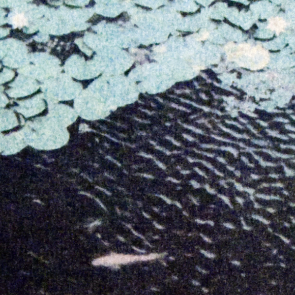
But I decided I liked the results in this print anyway, even if it wasn’t what I wanted. The darkest blacks are somewhat blue-black. And even the black seems to work with this image, just as it is. The high contrast brings out the details in the rippling patterns of the water, and the structure of the lotus pads. And there’s a lot of detail in a print this big. Here’s a detail from the print, slightly enlarged.
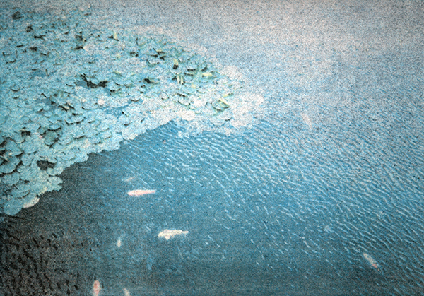
Update: I found another print of this image, it’s small enough to fit on my scanner so I can get improved color accuracy. It has a lighter black negative and doesn’t use UCR, so the midrange, bright colors are more apparent. And you can see fairly good detail in the lower left corner, that wasn’t visible in the other print. But this separation is bad too, you can see too much black in the light areas in the upper right. The midrange tones are pretty good but the light end lost detail. I think this was the separation that inspired me to see if UCR would do better. This separation still isn’t right, but it’s closer than the other one. I can do almost any variation of color separations to get any tonal scale I want, but it can get complex. Ideally I would make 8 negatives, two for each CMYK color, one for the high tones and one for the low tones.
1977: More Color Transfers
1977: Color Transfer
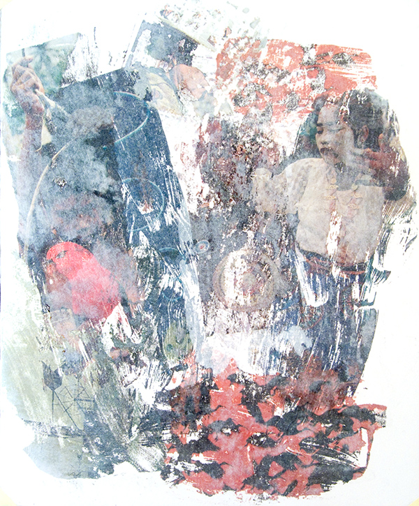
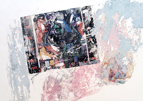
I found a cache of my ancient artwork from the 1970s, when I was an art student. I’ve been scanning and posting a few of them. I thought this was an interesting piece of collage, it’s a “color transfer” Solvent is applied to magazine photos, the photo is placed against the paper, and the back of the photo is burnished to transfer the image. I think in this one, the solvent was acrylic medium. It has a beautiful texture and the colors are fairly strong. Color transfers tend to have weak, transparent colors, it’s hard to transfer much of the ink.
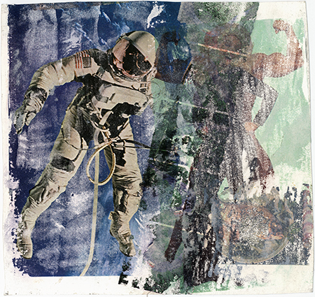
I found several of these prints, but this is the only one small enough to fit on my scanner, it’s about 8 inches square. I might post the other images later if I can get a good reproduction. These seem to be hard to capture.
I remember fiddling with color transfer a bit, sometime around ’77. This is what we used to do when we didn’t have photoshop. It is kind of like monoprinting, but you just have magazine photos as your source. You can manipulate the texture and depth of the transfer, but it’s pretty random. I guess we thought we were all Rauschenbergs, he used color transfer, but he had a professional printmaking atelier to do them properly. This color transfer process was popular around the printmaking department at the U of Iowa, it was so cheap and easy that a lot of students worked with it. But now it’s pretty much a lost art.
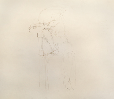
1976: Life Drawing 202
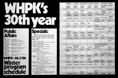
1974: My First Gig
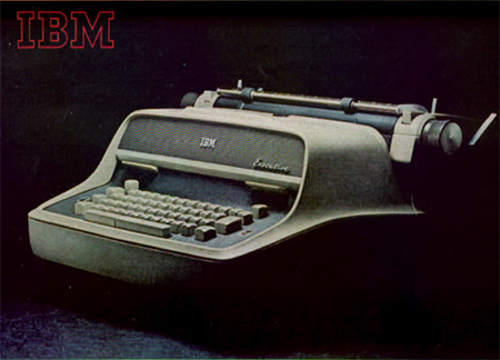
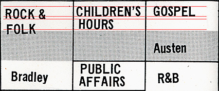
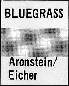

![]() The core idea of this poster was a chronological layout, using gray stripes to guide the eye across the grid. Today this design is known as “zebra stripes,” it’s very common, it is even used on computer screens to display long file lists. I got the idea from “green bar” computer paper, it had green zebra stripes to guide your eyes across 14 inch wide paper.
The core idea of this poster was a chronological layout, using gray stripes to guide the eye across the grid. Today this design is known as “zebra stripes,” it’s very common, it is even used on computer screens to display long file lists. I got the idea from “green bar” computer paper, it had green zebra stripes to guide your eyes across 14 inch wide paper.
stiff poster paper for this job.
Blizzard 2/1/2011
Iowa City had a severe blizzard last night, at least 15 inches of snow and 40 mph winds. The National Guard has been mobilized to handle a snow emergency. I always get stuck in my parking lot when it snows like this, and it can take a couple of days for the plow to dig us out. When the storm was over, this is what I saw.
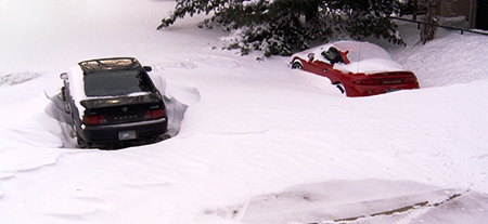
The wind was at just the right angle to blow the snowdrifts away from my car. Everyone else is buried 4 feet deep.
Update: The plow finally dug us out on Feb 4, three days after the blizzard.

