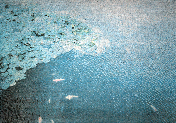
Here is another experimental print in my antique photochemistry process, I think I made it around 2004. Like a lot of prints I make, I thought this one was a failure. It certainly didn’t turn out the way I intended. But I decided it was not such a failure after all. This is a very large print, 11×16 inches, the largest print I ever attempted in this media.
I took this photo with a cheap Fuji disposable 35mm camera, this is the moat at Goryoukaku Fortress in Hakodate, Japan. I scanned the little 5×7 inch print and made digital color separations, that’s where I made the error. I was experimenting with CMYK “undercolor removal” for this color separation. When you have a dark, neutral color, it usually has a large amount of cyan, magenta, and yellow in it, in addition to black. UCR removes those “undercolors” and replaces them with black. But it was a failed experiment, the colors all went too much towards black, which covered up a lot of the brighter colors. This process is fairly high contrast, it has trouble conveying subtle colors. But I did manage to capture some nice, smooth tonal changes that are normally beyond the range of this process. There is a subtle change of light color across the top, as the green lotus pads float in in the blue water. But the darker tones in the left corner went to almost totally black, they were actually dark blue. I think this UCR method is not the way to go for this process, most people only print CMY and don’t print the black at all. This print might have done better with a lighter black layer, but it’s too late to redo the films now. The colors that do appear are subtle and generally faithful to the original (even if they’re a little faint).
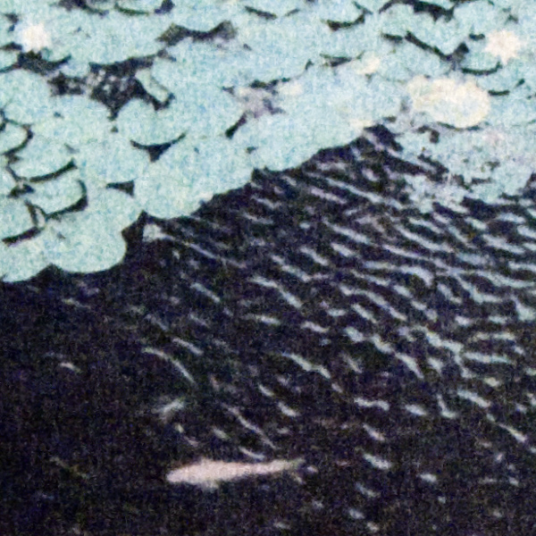
But I decided I liked the results in this print anyway, even if it wasn’t what I wanted. The darkest blacks are somewhat blue-black. And even the black seems to work with this image, just as it is. The high contrast brings out the details in the rippling patterns of the water, and the structure of the lotus pads. And there’s a lot of detail in a print this big. Here’s a detail from the print, slightly enlarged.
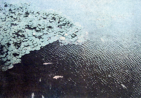
Update: I found another print of this image, it’s small enough to fit on my scanner so I can get improved color accuracy. It has a lighter black negative and doesn’t use UCR, so the midrange, bright colors are more apparent. And you can see fairly good detail in the lower left corner, that wasn’t visible in the other print. But this separation is bad too, you can see too much black in the light areas in the upper right. The midrange tones are pretty good but the light end lost detail. I think this was the separation that inspired me to see if UCR would do better. This separation still isn’t right, but it’s closer than the other one. I can do almost any variation of color separations to get any tonal scale I want, but it can get complex. Ideally I would make 8 negatives, two for each CMYK color, one for the high tones and one for the low tones.